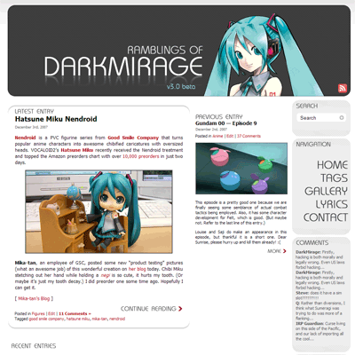
Woohoo! It’s that new layout that I was talking about! Yay! It took less time than I anticipated to finish it. WordPress is really quite a decent CMS.
It’s my first attempt at building my own WordPress theme instead of modifying the default one. There are still a lot of things that are incomplete (mainly plugin integrations) so I’m calling it “beta” for now. Why “version three” you ask? Well I just felt like it. Please don’t ask me to explain which layouts were version two and one…
Nitty gritties after the break.
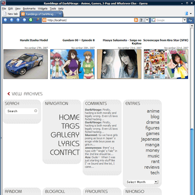
Header
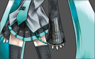
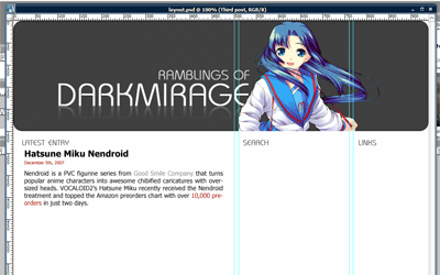
The first thing you should notice is the ginormous banner at the top of every page, featuring everyone’s favourite singing software’s 2D avatar, Hatsune Miku. This was a last minute decision during the initial planning stages and the layout itself is not actually inspired by her in any way. In fact, this is what the original draft in Photoshop looked like:
But after trying out a few characters, I decided that Miku’s colour scheme is the best match. Purely coincidental. Or maybe it’s one of those subconscious thing. I may eventually add more banners in a random rotation like my old layout, but that’s low priority for now.
Overview
The primary colours used in the theme are #a00, #555, #eee and #ccc. (I love colours that can be shortened to three-digit hexadecimal in CSS.) The RSS feed icon is a 24×24 greyscale PNG taken from Feed Icons’ devkit and overlayed with 100% #a00.
One of the most important decisions when designing a website is to choose between a fixed-width layout and a fluid layout. My previous layouts were all fixed to 780px wide so as to accommodate the smallest resolution that people still use, 800×600. It’s quite a commonly-used width because the default WordPress theme uses it.
The nice thing about fluid layouts is that they work on very tiny resolutions without creating horizontal scrolls. Moetron is an example of a 100% fluid layout. However, lines become very long and ugly when viewed on a larger-than-average resolution, such as 1920×1200 on 24″ widescreen. Paragraphs of text turn into single lines that stretch from one end of the screen to the other.
Most professional blogs are turning to either fixed layouts optimized for 1024 (e.g. Joystiq) or a mixture of fluid and fixed layouts (e.g. Engadget, ANN). The problem with the former is that on smaller resolutions (and windowed browsing), there will be horizontal scrolling involved. The latter is harder to design for and cross-browser implementation makes it a huge pain in the ass.
Same page viewed at 800px wide
I chose to go with a semi-compromise. I don’t like my text components changing width, so they are fixed-width. But the navigation bars on the right (or “meta blocks” as I dub them) will drop down to the bottom when viewed in 800×600 so that horizontal scrolling is avoided. I call it a semi-compromise because it all goes haywire if you use some non-standard window size that is between 800 and 1024. There is also some margin issues when moving the meta blocks down.
The design has been tested on the latest versions of Firefox, Opera and IE7. It looks the ugliest on IE7 due to font issues and probably worse on older IE versions due to the use of transparent PNG.
Thumbnails
Every post has at least two thumbnails that are automatically generated. New entries will have three. A 144×144 square thumbnail is for use within the meta blocks, a 180×120 rectangular thumbnail is used in archive mode and a 250×140 resized image is used for the “Previous Entry” section on the main page.
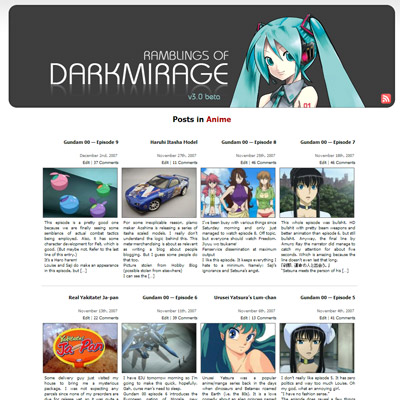
Thumbnail generation and caching are all handled by Alakhnor’s Post-thumb revisited plugin. Page-loading is slow for the first time when the thumbnails are generated but subsequent loadings use cached image files.
Sprite Navigation
Whoever first thought of making sprite navigation with CSS is a genius. Basically the mouse-over effect that you see on the right uses no Javascript, no image maps and consists of only one single image file:
![]()
Navigation sprite
Using only CSS background repositioning and a:hover, the concept is just brilliant. Not only does the effect work instantly without having to cache additional images, but it also works without relying on Javascript, which many people block with NoScript these days. I found the tutorial here.
Gravatar
You will also notice that the post comments now support Gravatar (Globally Recognized Avatars). If you register an account on gravatar.com and post a comment with the same e-mail address, your associated gravatar will be displayed below. The rest of you get a cool-looking ã‚ faded to grey! Awesome.
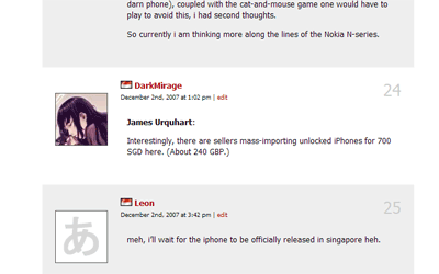
Gravatar
Final Notes
I don’t think the site is XHTML validated yet because I coded the layout on a local apache server and haven’t had the chance to submit it. A lot of areas are also not extensively tested, such as commenting and error handling. The comment fields in particular were a rushed job. If you notice anything wrong, please post here along with the browser used. Please note that I am not supporting any version of IE older than 7.
So anyway, what do you think?
P.S. I am aware that some posts have issues with the 144×144 thumbnail. I am in the process of fixing it.
Update: The site is note XHTML 1.0 Strict validated. Do inform me if you find any pages that aren’t.
Too cluttered. The old style was simpler, but more functional. Simple and functional beats neato and cluttered.
Also what does the squiggly default avatar mean?
I like it. I feel the graphic headers make navigation much easier, and attractive too.
somehow it feels faster than old one… :S
@Guner: ã‚ = a (hiragana)
whoops, text “search” doesn’t get removed when I clicked on it.
It’s faster partly because I moved to HostGator.
And partly because the old theme was really, really cluttered with useless function calls.
edogawaconan: Yeah I realized that. I will change that later. Working on validating the pages now.
=_= I suck at CSS. It’s probably why I still don’t have a site of my own.
checking avatar… :o
this new theme is nice, btw :p
nice layout…
though 1024 would be better imo…
but 800 is fine too…
now back to lurking for me…
Attractive. Feels harder to navigate but not too hard. I’ve no technical knowledge (hell, changing one theme for another tests my abilities . . .) so it’s hard for me to comment on the ins-and-outs of the CSS.
Uh. It is actually 1024. Well, 960.
Not a bad design. Will take some time to get used to it, but it’s pretty functional.
Wow, looks awesome! Good job. XD
Miku is love~! <3
I like everything up until the footer…that thing’s so huge it could be a page by itself. x.x
It’s smaller now. I forgot that the blogroll was being displayed for archive view too.
where’s my gravatar :S (just registered as seeing more blogs using it)
I run a gravatar cache. It doesn’t update immediately.
Only thing I kind of want is that you make it totaly clear that it´s you who are posting, like another color for the comments you make.
And my own thoughts is that you should keep it logical, if you have two sidebars to the right, keep them there. But I can´t complain at how it is now either since I find it really nice and user friendly.
As for creating your own theme, I salute you. Man I wish I could do that. I have basic CSS coding in my brain, but php is as far away as it could be. That and having to many things and not being able to decide what I should use tend to break my thoughts of creating my own theme…
Really like the colors though.
Nothing much more to say. Good job!
DM has leveled up.
How do I used Gravatar?
@ Guner
I beg to differ. I think it’s actually LESS clutter and it loads pretty fast too ^_^
@ DarkMirage
Great job! Any chance of distributing this theme to the public?? *wink*
The new design takes a bit of getting used to, but it is very refreshing and clean. Very nice work!
manga: I am planning to do that. I’m still trying to decide what’s the best way to do it. For now, just look for my gravatar. lol.
AK: Just sign up at http://www.gravatar.com with the same e-mail that you use to post comments on this blog. The script will automatically match gravatars with your e-mail.
nefesco: Sorry, it’s my precious creation. XD Anyway a lot of stuff are hard coded so it would take too much effort to release a generic version.
Lovely concept and work.
*checking how her diminutive gravatar looks here*
ohh…
gomen~
my bad…
still looks nice…
now time for me to go back to lurking…
I can understand that. That´s one of the reasons I never create a own theme as well. But in my case I´m just to lazy to learn :(
Maybe some other time.
It’s done. The red comment numbers are me.
wow, this new site design is really pretty. Yet another template to review when i set up my new version =/
new layout looks nice
*only wants to see his gravatar*
I realised that some of the pictures in the random entries column cannot be displayed. And the random entries colulmn is displayed BELOW the post, is that normal? I am using IE7 by the way. The related entries positioning is also a bit awkward to me.. Great theme by the way, I like the colour scheme
Well the position is correct, but the padding/margin around it is indeed a bit weird in IE7… Sigh.
Edit: This issue is fixed. Probably. Try refreshing.
I like the new scheme, but not necessarily Miku at the top. :P
FYI your layout looks terrible in IE 6
I normally use firefox at home but at work its IE and it’s like all over the place. Well that depends if you really care about your IE6 visitors (id think most people are on 7 by now anyway)
random migrated beside previous button post in the left (in the left between post and comments)…
Looks great in Firefox 2 =]
I wish I had some decent skill with PS and coding CSS o_o then I could make my own design that looks halfway decent.
Hinano: Ideally I would like my layout to be at least readable in IE6. But I don’t have IE6 to test it out and making all the floating elements work in IE6 is probably next to impossible anyway. :( Why are you surfing blogs at work anyway? >_>
edogawaconan: Random is supposed to be there. If the margins look weird, try refreshing. If it still looks weird, then it’s just my taste. XD
Looks damn awesome!
ã‚。。。
Does anybody still visit blogs directly except to comment? I read everything through RSS…
Ian: Yeah, I’m getting into the habit of doing that, unless the blog blocks hotlinking of images, which then forces me to go to the site to view the images.
Looks great! Cant go wrong with Hatsune Miku ^^
Quite a nice background and layout, but the navigation is quite confusing.
Yeah that is about it. I am not really in a mood to comment because BeForU is disbanding tomorrow.
http://blog.oricon.co.jp/bewings/
It’s really amazing. We can have avatars now, so I guess…sig next?
I will anticipating that :)
On a side note, you might want to make the hover effect on the entries portions.
i wonder if the sprite navi is the same used for sprite games..
and do u plan to change the sidebar on the left?…
overall, the theme is there. ^_^
I think it looks very nice but at the same time I miss the blue colors… ;_; Ah well, just a matter of getting used to it I guess.
I have no plan for the left side right now.
And the CSS behind it was indeed inspired by sprites used in games. For example, a sprite containing all the various poses of a character is loaded by a game into the RAM and only one them is cropped out for display. In this way changing the pose is faster and the game only needs to load one picture file.
nice I kind of like the only problem is maybe the spaces (margin padding) between elements I mean to go to the comment part I have to scroll like an idiot or pressing page down like X button on PlayStation. (A button on old school arcade machine).
The problem is expecially with comments.
About the page validation you can use the firefox extension
Tidy HTML Validator.
it’s validate pages on the fly without the need to go the w3c.
for now there is an empty href in the end of the page.
and two JS errors. one is a usual one with the google analistic the other from the thichbox plug in. (btw why you have prototype and jQuery on the one page it can really mess the things. and it’a s little hm waste of space :D)
The other things in the design are good :) and :hover for life :D
My post content is wider now so the post is actually shorter if you compare it to the old layout.
That said, the comment area is indeed longer now. This is because I set
min-height:100pxfor each comment in order to accommodate the 80×80 gravatar. I will think about how to make it shorter.prototype.js is being loaded by a plugin. I’m not sure which one. Will check it later.
Cool, I am loving the redesign… Seeing this makes me feel bad about how lazy I am on my projects at the moment though T__T
What I love is the feeling of a wider space. Before it seemed so condensed and packed in. Again, I love the new redesign!
This re-design is great very professional looking.
If I didn’t know this was wordpress I would have thought it was a professional website.
Good Job.
On a second more thorough look of the site, I have these comments to add…
1. I felt the sidebar modules near the footer on the home page looks kinda weird and I appreciate how you have designed so as to accommodate the smaller screened visitors but I felt that that could somehow be made to look more appealing to look at. I saw an article on liquid equal column length at alistapart.com but not sure if that would work well in this situation. The white space created around there just looked odd to me…
2. Where did comment permalinks go?
3. Would be appreciated if the gravatars linked to the commenter’s site instead of just all to gravatar.com
4. Wondering why Tags changes to Tag on hover in navigation but that is minor. I think it is the image…
5. I am especially loving the image to post coupling, it makes browsing the archives so much easier.
6. Some more headers would be cool but like you said, that was a low priority at the moment…
Apart from that, I feel this is an excellent design. Good job!
The “Current” heading on the left side indicates the most recent post made?