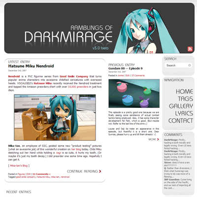
DarkMirage.com v3.0 beta
Woohoo! It’s that new layout that I was talking about! Yay! It took less time than I anticipated to finish it. WordPress is really quite a decent CMS.
It’s my first attempt at building my own WordPress theme instead of modifying the default one. There are still a lot of things that are incomplete (mainly plugin integrations) so I’m calling it “beta” for now. Why “version three” you ask? Well I just felt like it. Please don’t ask me to explain which layouts were version two and one…
Nitty gritties after the break.
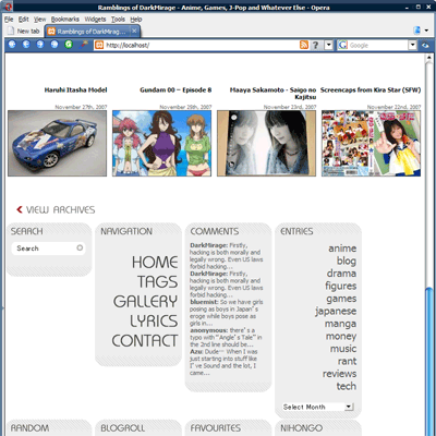
Header
The first thing you should notice is the ginormous banner at the top of every page, featuring everyone’s favourite singing software’s 2D avatar, Hatsune Miku. This was a last minute decision during the initial planning stages and the layout itself is not actually inspired by her in any way. In fact, this is what the original draft in Photoshop looked like:
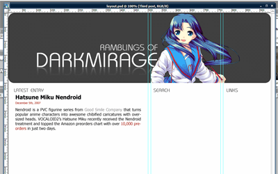
But after trying out a few characters, I decided that Miku’s colour scheme is the best match. Purely coincidental. Or maybe it’s one of those subconscious thing. I may eventually add more banners in a random rotation like my old layout, but that’s low priority for now.
Overview
The primary colours used in the theme are #a00, #555, #eee and #ccc. (I love colours that can be shortened to three-digit hexadecimal in CSS.) The RSS feed icon is a 24×24 greyscale PNG taken from Feed Icons’ devkit and overlayed with 100% #a00.
One of the most important decisions when designing a website is to choose between a fixed-width layout and a fluid layout. My previous layouts were all fixed to 780px wide so as to accommodate the smallest resolution that people still use, 800×600. It’s quite a commonly-used width because the default WordPress theme uses it.
The nice thing about fluid layouts is that they work on very tiny resolutions without creating horizontal scrolls. Moetron is an example of a 100% fluid layout. However, lines become very long and ugly when viewed on a larger-than-average resolution, such as 1920×1200 on 24″ widescreen. Paragraphs of text turn into single lines that stretch from one end of the screen to the other.
Most professional blogs are turning to either fixed layouts optimized for 1024 (e.g. Joystiq) or a mixture of fluid and fixed layouts (e.g. Engadget, ANN). The problem with the former is that on smaller resolutions (and windowed browsing), there will be horizontal scrolling involved. The latter is harder to design for and cross-browser implementation makes it a huge pain in the ass.
Same page viewed at 800px wide
I chose to go with a semi-compromise. I don’t like my text components changing width, so they are fixed-width. But the navigation bars on the right (or “meta blocks” as I dub them) will drop down to the bottom when viewed in 800×600 so that horizontal scrolling is avoided. I call it a semi-compromise because it all goes haywire if you use some non-standard window size that is between 800 and 1024. There is also some margin issues when moving the meta blocks down.
The design has been tested on the latest versions of Firefox, Opera and IE7. It looks the ugliest on IE7 due to font issues and probably worse on older IE versions due to the use of transparent PNG.
Thumbnails
Every post has at least two thumbnails that are automatically generated. New entries will have three. A 144×144 square thumbnail is for use within the meta blocks, a 180×120 rectangular thumbnail is used in archive mode and a 250×140 resized image is used for the “Previous Entry” section on the main page.
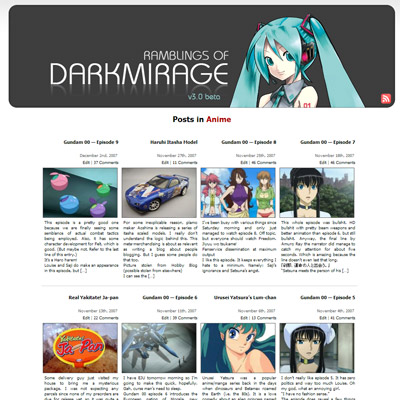
Thumbnail generation and caching are all handled by Alakhnor’s Post-thumb revisited plugin. Page-loading is slow for the first time when the thumbnails are generated but subsequent loadings use cached image files.
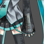
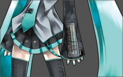
Sprite Navigation
Whoever first thought of making sprite navigation with CSS is a genius. Basically the mouse-over effect that you see on the right uses no Javascript, no image maps and consists of only one single image file:
Navigation sprite
Using only CSS background repositioning and a:hover, the concept is just brilliant. Not only does the effect work instantly without having to cache additional images, but it also works without relying on Javascript, which many people block with NoScript these days. I found the tutorial here.
Gravatar
You will also notice that the post comments now support Gravatar (Globally Recognized Avatars). If you register an account on gravatar.com and post a comment with the same e-mail address, your associated gravatar will be displayed below. The rest of you get a cool-looking あ faded to grey! Awesome.
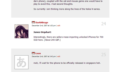
Gravatar
Final Notes
I don’t think the site is XHTML validated yet because I coded the layout on a local apache server and haven’t had the chance to submit it. A lot of areas are also not extensively tested, such as commenting and error handling. The comment fields in particular were a rushed job. If you notice anything wrong, please post here along with the browser used. Please note that I am not supporting any version of IE older than 7.
So anyway, what do you think?
P.S. I am aware that some posts have issues with the 144×144 thumbnail. I am in the process of fixing it.
Update: The site is note XHTML 1.0 Strict validated. Do inform me if you find any pages that aren’t.


December 12th, 2007 at 3:35 am
your header is awesome. lol
December 12th, 2007 at 4:23 am
Amazing new layout.
December 12th, 2007 at 6:39 am
Will you still have a revolving banner at the top?
That was always a nice little touch to the site.
December 12th, 2007 at 9:09 am
I like this gravatar thing. I’m scrolling through all those comments and I can see 90% bishoujo, 10% gender ambivalent.
December 12th, 2007 at 10:05 am
I actually preferred the minimalist-ness of the front page of the previous layout. ><;;
I think the new one is a little too loud of cluttered.
December 12th, 2007 at 10:18 am
Oh yay!
But I’d rather like to view five or six or more blog entries in chronological order, in large print, with longer abstracts for when I don’t visit everyday.
Also, do want moar Kagamine Rin. Your choice for twin, Ren. I think he makes the pair creepy, in my ohpainion…
Otherwise: Oh yay!
December 12th, 2007 at 10:26 am
Everyone is in love with Hatsune these days… The new layout is pretty slick if a bit disorienting at first.
December 12th, 2007 at 10:27 am
Nice total remixing.
I have a bit of a helpful suggestion, though: faithful readers will want two selectable choices to view the blog, in either the new remixed 3.0 or the classic 2.0.
December 12th, 2007 at 10:34 am
One of these days, I should get a nice fancy layout like yours for MY bloog. Then again, maybe I should update it more often…. =P
December 12th, 2007 at 10:38 am
Looks awesome. The only problem is that the title for the comments is just floating out there. Maybe you should connect “Comments” to something. :O
December 12th, 2007 at 10:53 am
Very nice.
December 12th, 2007 at 11:36 am
Deranged: Comment permalinks were actually removed long ago because it doesn’t really work well with paged comments. For gravatar, I will look into modifying the plugin. The “tag” thing is a mistake lol. As for the navigation bar, it’s not just to accomodate smaller resolutions, it’s also to restrict vertical scrolling on the main page. Maybe I can put something in the white space there…
Kip: I changed it because I don’t want to main page to stretch to infinity. You can actually view the full abstruct (everything before <!–more–>) in an RSS reader.
TheBigN: It’s actually the current post you are viewing lol. Kind of redundant I guess… But your idea is a good one. I’ll add that in.
RaptorFB: Eventually, when I find a good picture.
zeroshiki: I won’t call it minimalistic… The amount of stuff is the same, just stretched out over a longer length. I guess it’s more compact now. (The front page that is.)
soul.assassin: Well I don’t think I want to do that because I’d have to update two layouts when I add new plugins…
December 12th, 2007 at 12:02 pm
Wow, this looks pretty good. Miku FTW!
December 12th, 2007 at 12:14 pm
Pretty spiffy, excellent work DM.
December 12th, 2007 at 2:58 pm
wonderful! simple, neat and functional :D
December 12th, 2007 at 3:19 pm
Very nicely done =D
December 12th, 2007 at 3:20 pm
I guess it is more compact. I’m sure I’ll get used to it.
At first glance it looks a little loud though.
December 12th, 2007 at 5:22 pm
cool! nice job there
December 12th, 2007 at 6:05 pm
Nice!
Love the new look
December 12th, 2007 at 7:28 pm
nicely done. gr8 job!
December 12th, 2007 at 10:56 pm
Wow, this looks great. I especially like the font. :D
I don’t know if it’s just me only, but I accessed the site and it gave me a timeout for the first try, and the pages loaded a little slow than usual.
December 13th, 2007 at 8:42 am
0_0
Actually, i like it. Takes a bit of getting used to, but it’s ok.
My only criticism would be that the “Leave a Reply” seems to have had memory loss (i.e. it doesn’t seem to be automatically filling in my details anymore).
As for appearance, well it looks pretty fine in Safari 3.
As for Internet Explorer, i guess there is only so much one can do to make a site look good in that. (Though i did read an article the other day which noted that IE supported Javascript expressions in CSS, which i thought might be useful in fixing buggy CSS layout handling)
Keep up the good work. :)
December 13th, 2007 at 12:55 pm
Go make different layouts for your blog!!!
December 13th, 2007 at 6:39 pm
Congrats on No JavaScript Errors and Valid XHTML :)
December 13th, 2007 at 9:04 pm
It looks liek Dannychoo’s site.
December 13th, 2007 at 10:35 pm
PCGamer: Thanks. Although I didn’t really do anything to the Javascript…
tj han: Because it has a white background and a lot of pictures? >_> Well that’s okay I guess. At least it doesn’t look like every other K2 or Kubrick WordPress site. *cough*
December 13th, 2007 at 11:21 pm
Much improved from the old one.
Very nice =)
December 14th, 2007 at 2:26 am
I like it. Good work on it, and props on using Miku :p
December 14th, 2007 at 9:36 am
Hey , DM , apart from the fact that it’s a bit too grey , that’s a kickass new Layout . Good job !
December 14th, 2007 at 11:21 am
Selectable color schemes would be kickass, but imagine the work that would go into making that. O.O
December 14th, 2007 at 2:10 pm
Good job on the re-design! I’m using IE 6, and it looks great. Currently trying to re-design my themes as well. hope your post gave me some good pointers. >.<
December 14th, 2007 at 2:56 pm
WOW! this layout is really beautiful. even better-looking than the previous one. It has the refreshing look! NICE ONE!
December 14th, 2007 at 6:35 pm
your layout rocks. 3 words is enough to describe it. lol
December 14th, 2007 at 9:26 pm
I absolutely love the new design. Nao share teh sauce code.
December 14th, 2007 at 10:13 pm
second tsubaki’s motion.. XD
December 14th, 2007 at 10:25 pm
The design is not bad. Really.
Anyway are you going to the Anime@Expo tomorrow?
December 14th, 2007 at 10:27 pm
I must say I’m loving the new layout. Very organized and appealing to the eye. :3
December 15th, 2007 at 10:23 am
nice layout! if i had to criticise, i think the text on right is a bit too big and cramped together. they’r bringing a bit too much attention to themselves, away from the main body text…
before:
http://img155.imageshack.us/img155/5089/text01jo5.jpg
after a quick photoshopping:
http://img520.imageshack.us/img520/262/text02ku8.jpg
but great job! XD
December 15th, 2007 at 1:41 pm
Nice site – using noscript here, cool that you got it working without js. :)
By the way, were you at algo mania yesterday?
December 15th, 2007 at 11:59 pm
I am usually just reading and I don’t comment, but I wanted to say that I love your new layout.
I don’t know anything about how this works and how it’s done, nor do I care, but I am a sucker for pretty visuals and this just looks great to me. So good job.
December 16th, 2007 at 12:33 am
Alexis you really are Bulgarian too ? or it is bug in the ip checker ?
December 16th, 2007 at 5:37 am
your layout is AWESOME!!!! i wish i knew how to use css. it’s so cool that i’m gonna explore it :)
December 16th, 2007 at 5:56 am
The new design is excellent. Good job ! :)
December 21st, 2007 at 3:55 am
Hey man! The site looks great, just stopping by to say thanks for the link to stylemeltdown for the tutorial. :)
Cheers!
December 23rd, 2007 at 10:20 pm
Nice upgrade over the old design :)
Especially like how the recent entries are displayed with the thumbs — the pics make the entries more attractive to explore, I think.
December 26th, 2007 at 5:28 am
Testing avatar…
Trackback from
The Fool » Blog Archive » A new theme…April 13th, 2008 at 5:50 am
[...] the colors, I really liked DarkMirage´s choice of colors when he created his new theme. So I used the a00 color for the links. Then I took head to what a friend told me about the colors [...]